Search News
Industry Portal
Hot Articles
- Maine DEP Updates Packaging EPR Timeline, Plans to Revise Stewardship RFPMaine packaging EPR timeline updates and a revised stewardship RFP could affect business planning. Discover what companies should watch next.
- How run size affects the cost of holographic packaging for spiritsSee how holographic packaging for spirits costs change with run size. Compare setup fees, volume savings and inventory risks to choose the right quantity for your brand.
- How to choose printable clear PET film for your inkjet printerNeed clear PET film printable on your inkjet printer? Compare coatings, ink compatibility, clarity, and feeding to avoid costly misprints and choose confidently.
Popular Tags
How printed flexible packaging films affect shelf appeal
Time
Click Count
Shelf appeal is not created by graphics alone. In flexible packaging, the printed film determines how a brand is seen under real retail conditions: at a distance, under uneven lighting, beside competing packs, through a display window, and often after transport, handling, or refrigeration. A visually ambitious design can lose much of its intended effect if the substrate is hazy, the ink system lacks contrast, the metallization is poorly controlled, or the barrier structure causes distortion, curl, or reverse-side show-through.
The commercial question is therefore not whether printing makes a flexible pack more attractive. It is whether the selected printed film can reliably express the product’s value proposition while preserving the protection, runnability, compliance profile, and cost discipline required for its route to market. The strongest packaging decisions treat shelf impact as a system outcome rather than a surface decoration.
Visibility begins with what the shopper can read in seconds
On a crowded shelf, consumers do not inspect every pack in sequence. They first register blocks of color, pack silhouette, logo position, reflective cues, and the contrast between the product category and its surroundings. Printed flexible packaging films influence each of these signals because the film is both the graphic carrier and, in many formats, the outermost visible surface.
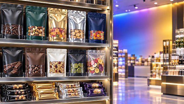
Color is often discussed as a brand asset, but its shelf function is more practical: it creates recognition and separates variants. A dark matte coffee pouch, a high-gloss snack wrapper, and a transparent stand-up pouch containing brightly colored confectionery communicate very different category cues before any text is read. The selected film construction determines whether those intended cues survive conversion and filling.
For example, reverse printing on a clear outer web protects the graphics within a laminate and can create a clean, high-gloss visual effect. Yet the visual result depends heavily on film clarity, adhesive appearance, and the opacity of the inner sealant or barrier layer. If a white ink layer is expected to provide a solid background but is insufficiently opaque, the color or texture of the product-facing layer may alter the final shade. This is particularly relevant where a design uses pale pastels, fine typography, or branded white space.
Opaque structures produce a different result. White-pigmented films, coated substrates, and metallized laminates give designers greater control over the visual field behind the print. They can sharpen contrast and conceal product variation, but they also remove the reassurance that a product window can provide. The decision is not simply “transparent versus opaque.” It is a choice between product visibility, graphic consistency, barrier needs, waste sorting considerations, and the brand’s intended shelf signal.
Film surface quality sets the ceiling for print quality
A printing press can reproduce sophisticated artwork only as well as the film surface allows. Surface energy, smoothness, gauge consistency, slip behavior, coating chemistry, and dimensional stability all affect ink transfer and the perceived quality of the printed image.
BOPP, PET, PE, and other flexible substrates do not behave identically in printing or lamination. A glossy biaxially oriented polypropylene film may offer excellent visual brilliance and stiffness for flow wraps or overwraps, while polyester is often selected where dimensional stability, heat resistance, or robust reverse printing is important. Polyethylene structures can support recyclable mono-material designs in certain applications, but their lower stiffness and different surface characteristics require careful control of printing, drying, and downstream converting conditions.
For shelf appearance, the key distinction is between an image that looks technically printed and one that looks intentional. Uneven ink laydown, mottling in solid areas, poor trapping between colors, weak fine-line definition, or variable gloss can make a premium graphic appear inexpensive even when the design itself is strong. These faults are especially visible on large dark areas, metallic colors, gradients, and minimalist layouts where there is little visual complexity to disguise variation.
Surface treatment is central to this issue. Corona treatment or other surface-modification methods are used to improve ink and adhesive anchorage on low-surface-energy films. Treatment levels cannot be viewed as a one-time specification alone. Treatment can diminish during storage, and contamination from additives, migration, or handling can interfere with print performance. A commercial approval based on an early trial should therefore be linked to defined material storage, treatment verification, and printing conditions rather than treated as proof that every future production run will match.
Color fidelity is a supply-chain control issue, not merely a design issue
Brand owners often specify a target color, but a target is not the same as a reproducible result. The same artwork can look different when printed by gravure, flexography, or digital processes; on gloss film versus matte film; over a white base versus clear film; or under retail LEDs rather than daylight. Ink formulation, anilox selection, engraving characteristics, drying energy, press speed, and overprint varnish all contribute to the final appearance.
This matters commercially because color inconsistency can weaken range recognition across markets, pack sizes, and manufacturing locations. It can also produce avoidable approval cycles when creative teams assess a proof under conditions that do not resemble the actual selling environment.
A more reliable evaluation begins with the finished construction rather than the press sheet. Color should be assessed after lamination, curing, coating, and, where relevant, after exposure to the operating conditions the pack will encounter. Refrigerated distribution, product oils, retort processing, abrasion in secondary packaging, and exposure to humidity can all change the apparent surface quality. A glossy sample before filling says little about how the pack will look after it has passed through form-fill-seal equipment or spent time in a retail chiller.
For branded ranges, the most useful control documents tend to define more than artwork files. They identify approved substrate grades, color standards, viewing conditions, permitted variation, ink system, white-opacity requirements, finish requirements, and the approved laminate sequence. Without that connection between design and material construction, color approval can become subjective and difficult to repeat across suppliers.
Gloss, matte, and tactile effects communicate product position
Visual shelf impact is not limited to hue and imagery. The way a package reflects light affects how it is interpreted. Glossy films intensify saturation and can make images appear more vivid, particularly in snacks, confectionery, pet food, and personal-care formats. They also make scuffing, fingerprints, and small surface defects easier to see.
Matte films reduce reflection and can create a quieter, more premium or natural appearance. Their value is strongest when the design uses restrained graphics, earthy color palettes, or tactile cues that support a product narrative. But matte is not automatically premium. A low-quality matte surface may appear chalky, inconsistent, or easily marked. Its suitability should be judged against the full handling cycle, including stacking, shipping, shelf replenishment, and consumer use.
Selective effects can make a pack more legible than a uniformly glossy or matte surface. A matte background with gloss highlights can pull attention toward a logo or product image. A tactile lacquer can create a sensory distinction on a pouch that would otherwise feel similar to neighboring products. Raised or textured effects may reinforce category cues such as craft, luxury, natural ingredients, or technical performance.
These treatments require restraint and engineering discipline. Heavy coatings can alter coefficient of friction, affect winding behavior, create blocking risks, or complicate heat-seal performance if applied in unsuitable areas. Textured finishes may also reduce the clarity of small printed text. Any finish selected for shelf appeal needs a defined functional boundary: where it is applied, what equipment it will run on, how it will resist scuffing, and whether it affects recycling or material separation objectives.
Metallic and holographic effects attract attention, but can obscure the message
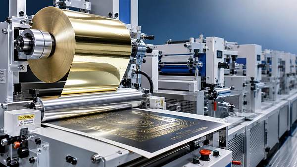
Metallized films, cold-transfer effects, hot-stamping foils, and holographic patterns offer a powerful route to shelf differentiation because they change appearance as the viewing angle changes. On premium beverage, cosmetics, gift, and specialty food packs, controlled reflectivity can signal value before the shopper reads the brand name.
However, reflective packaging creates a trade-off between attention and readability. Highly reflective areas can produce glare under strong store lighting. Fine text printed over metallic backgrounds may lose contrast, and barcode performance can be affected if the code area is not designed with adequate opacity and contrast. A pack that catches the eye but makes mandatory information difficult to read has solved only part of the problem.
The better use of metallic effects is typically directional. They can frame a brand mark, distinguish a limited edition, create hierarchy between a master brand and product variant, or add depth to selected illustration elements. When metallic treatment covers the entire package without a clear graphic purpose, it can flatten the information hierarchy and make adjacent variants harder to distinguish.
Metallic films also need to be assessed as barrier components, not only decorative layers. Metallization may contribute to light, moisture, or oxygen resistance depending on the construction, but its performance is sensitive to pinholes, flex cracking, and laminate integrity. A structure selected primarily for visual shine should not be assumed to provide a given protective function without relevant validation for the product and distribution conditions.
Transparency can build trust, provided the product can carry the visual load
Clear windows and transparent packs are frequently used to make the product itself part of the shelf presentation. This can be effective for foods with visible inclusions, distinctive shapes, natural colors, or an appearance that conveys freshness. It can also reduce the need for printed product photography, which may be valuable when the actual contents are more persuasive than a stylized image.
Transparency has limits. It exposes fill-level variation, product breakage, powder dusting, oil migration, and visual changes caused by aging or temperature. For light-sensitive products, a large window may conflict with protection requirements. For products with an inconsistent natural appearance, visibility can introduce doubt rather than reassurance.
The decision should therefore start with a simple question: does seeing the product increase confidence at the moment of selection? If it does, the window needs to remain clear after lamination, filling, and handling. If it does not, a controlled graphic presentation may be more commercially effective than transparent film.
Barrier performance protects shelf appeal after the pack has left the converter
A visually strong package loses value if the product inside deteriorates, if the pouch wrinkles excessively, or if the outer surface becomes damaged before purchase. Barrier properties and mechanical design are therefore part of shelf appeal, even though they are not always visible in an artwork review.
For oxygen- or moisture-sensitive products, the selected barrier structure supports the product condition that the graphics promise: crisp snacks, stable powders, protected aromas, dry electronics, or clean pharmaceutical presentations. The correct barrier level depends on the product, target shelf life, pack geometry, filling atmosphere, seal integrity, and distribution route. It cannot be determined from film type alone.
Mechanical behavior matters just as much. A film that is too soft may sag on a peg or lose the front-panel shape needed for shelf blocking. A structure that is too stiff may crease at flex points, creating unattractive whitening or cracking. Seal contamination, poor seal geometry, and weak interlayer adhesion can also turn a premium-looking format into a visibly compromised pack. These are not merely quality defects; they undermine the visual confidence the printed surface is intended to create.
Designing printed flexible films around the retail environment
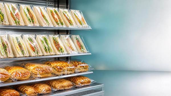
Retail lighting, shelving format, product orientation, and proximity to competitors should influence film and print decisions early. A pouch displayed face-on has different requirements from a horizontal flow wrap where only part of the front panel may be visible. Products sold in freezer cabinets face condensation and reduced color perception. E-commerce-ready packs may receive less sustained shelf viewing but more abrasion during fulfillment and a more important unboxing moment.
Artwork evaluation should use the anticipated pack shape and viewing distance. Flat proofs are useful for checking content, but they cannot reveal how gussets interrupt graphics, how a zipper changes front-panel tension, or how a reflective finish behaves on a curved pack. Where several SKUs share a shelf, they should be reviewed together rather than in isolation. The aim is not to make every pack visually louder; it is to make the range easy to navigate while preserving recognition at the brand level.
Printed flexible packaging films create shelf appeal when materials, print execution, and pack function reinforce one another. Clarity supports transparent product stories. Opacity gives color control. Matte, gloss, and metallic effects establish hierarchy and perceived value. Barrier and mechanical performance ensure that the package still looks credible at the moment it is selected. The most defensible packaging choice is the one that delivers that combined result consistently, not the one that produces the most striking sample under ideal conditions.
Recommended News
 Oct 24, 2026Duo Packaging Introduces Graphene-Enhanced Flexible PE FilmExplore Duo Packaging’s graphene-enhanced PE film, 2DPE, with 60% recycled content and retained strength. See how a QVC UK trial signals potential material, carbon and cost savings.
 Oct 14, 2026How heat affects shrinkage in 36-micron oriented polyester filmExplore how heat affects oriented polyester film 36 micron. Compare MD/TD shrinkage, test conditions, and process controls to select the right grade and improve converting stability.
 Oct 13, 2026How to assess a biaxially oriented film manufacturer's thickness controlAssess a Biaxially Oriented Films manufacturer's thickness control with practical checks on uniformity, measurement accuracy, and roll traceability. Learn how to qualify reliable suppliers.
 Oct 19, 2026Assessing Used Calender Line Compatibility for Coated Synthetic LeatherSynthetic leather calendering line compatibility guide: evaluate rolls, thermal control, web handling, tooling, and safety before buying used equipment.
 Sep 29, 2026How printed flexible packaging films affect shelf appealFlexible Packaging Films printed solutions shape shelf appeal through color fidelity, surface finishes, transparency, barrier performance, and retail-ready durability. Explore how to create packaging that stands out and protects value.
 Sep 22, 2026What drives film coating technology cost in a new production line?Film coating technology cost depends on more than equipment price. Explore key drivers, yield risks, throughput, and lifecycle ROI for smarter line investment.
 Sep 17, 2026Standard Test Methods for Coated Paper: Barrier Performance and RecyclabilityStandard test methods coated paper barrier performance recyclability: verify moisture, grease, oxygen protection and real recycling outcomes for finished packs.
 Sep 21, 2026Used Synthetic Leather Calendering Lines: What to Inspect Before PurchaseSynthetic leather calendering line buying guide: inspect rolls, drives, thermal systems, controls, safety, and web handling before purchasing used equipment.
 Sep 02, 2026When do high clarity films for food wraps improve shelf appeal?High clarity films for food wraps boost shelf appeal by showcasing freshness, texture, and quality while balancing seal performance, protection, and retail-ready presentation.
 Sep 01, 2026How to prevent peeling when using printable transfer foilsTransfer foils printable: prevent peeling with proven tips on substrate prep, ink compatibility, curing, and transfer settings for durable, premium results.
 Aug 30, 2026How PET packaging sheets affect thermoforming consistencyPET packaging sheets directly influence thermoforming consistency. Explore how gauge profile, IV, thermal behavior, and rPET content affect quality, scrap, and line performance.
 Sep 02, 2026When a PVC Transfer Coating Line Fits Better Than Direct Coating in Flexible MaterialsPVC transfer coating line or direct coating? Learn when transfer coating delivers better surface quality, substrate protection, and process stability for flexible materials.
 Aug 23, 2026When does solvent free film coating technology improve coating consistency?Solvent free film coating technology improves coating consistency when drying variability, thermal stress, and residual solvent risks limit quality. Learn when it truly delivers repeatable performance.
 Aug 15, 2026What drives micro coating materials price in industrial use?Micro coating materials price depends on chemistry, process control, substrate fit, and compliance. Learn what really drives cost in industrial use and how to choose smarter.
 Jul 22, 2026Metallized Film Physics in Vacuum Deposition: Key Factors Behind Barrier and Optical PerformanceMetallized film physics vacuum deposition explained: discover how substrate, chamber control, and layer uniformity shape barrier, gloss, and converting performance across packaging applications.
 Jul 27, 2026How to Evaluate a Used PVC Coating Calendering Line Before PurchaseUsed PVC coating calendering line buyers: learn how to assess process fit, roller condition, controls, compliance, and total cost before purchase to avoid hidden risks.
 Jul 21, 2026Vacuum Metallized Paper: Key Properties, Uses, and LimitsVacuum metallized paper explained: discover its key properties, packaging uses, print benefits, and limits to choose the right premium, cost-effective material.
 Jul 18, 2026How to Evaluate Micro Coating Materials in Europe for Performance and ComplianceMicro coating materials Europe buyers can use this guide to compare performance, compliance, recyclability, and supplier quality for smarter sourcing and faster qualification.
 Jul 15, 2026Film Coating Technology for BOPP: Key Methods and Performance TradeoffsFilm coating technology for BOPP explained: compare acrylic, PVDC, water-based, and specialty coatings, understand barrier and sealing tradeoffs, and choose the right path for cost, compliance, and performance.
 Jul 09, 2026Packaging Supplier References for Films: What to Verify Before ApprovalPackaging supplier references for films help you verify quality, compliance, consistency, and delivery risk before approval. Learn what to check to avoid costly packaging failures.
 Jul 08, 2026Biaxial Film Europe: 2026 Supply, Pricing, and Regulation OutlookBiaxial film Europe in 2026 faces shifting supply, pricing, and PPWR pressure. Explore key BOPP and PET risks, cost drivers, and smart sourcing strategies.
 Jul 05, 2026How Thin Film Coating Technology Improves Barrier and Surface PerformanceThin film coating technology improves barrier strength, printability, adhesion, and durability across packaging and labels. Learn how to choose smarter coatings for performance, compliance, and cost.
 Jul 02, 2026Pharmaceutical Packaging Films in 2026: Barrier and Sustainability ShiftsPharmaceutical packaging films in 2026 face a new test: balancing barrier performance, compliance, and sustainability. Explore key shifts shaping smarter, lower-risk packaging decisions.
 Jul 11, 2026Artificial Leather Coating Line: Process, Risk and Procurement NotesBuyer notes on artificial leather coating line process flow, PVC coating calendering risks, used-machine checks and procurement decisions.